Thursday 26 November 2009

I found a slot for Fremen

Right inbetween Effetre Sky Blue 224 and Effetre Opaque Light Turquoise 234!


The long bead uses CIM Sapphire on end and CIM Leaky Pen on the other ... just because ... (incidentally, the LP pitted on this bead).


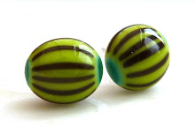
The lentil on the left is made with Sky Blue and Effetre Copper Green, the one on the right is Fremen and CG - the Fremen is a little darker.


Fremen is such a pretty bright blue, I'm really pleased with how it turned out in this twistie made with raku, layered over Peace and silver foil.


Fantastic contrast between Fremen and the centre band of Stoneground - gotta do this again!


Slytherin ... so much nicer than it sounds!


Question: "We designed Slytherin to be dense enough to make twisties or leaf/vine cane. Were we successful?"


Did somebody mention twisties? Didn't I see Jolene trying out twisties with Slytherin? That's it, I can't resist, gotta have a go!


I used a base of CIM Peace, wrapped in silver foil then added my Slytherin twistie (made with raku and a little stoneground), chucked in a few dots here and there of more Slytherin, Stoneground, Raku and some Effetre Violet.


I added a stripe of Slytherin around this bead, I think I'll call it Soft n Swampy Slytherin - must remember to use less next time!


Answer: Yes :0)

Wednesday 25 November 2009

Whites

I ran some pretty simple comparison tests with all the CIM whites: Peace, Marshmallow and Cirrus against Effetre White 204.


In the interests of my Sunbaked beads, I'm always on the lookout for new glasses that don't react to a wrap of silver wire - sadly, I won't be adding any of the CIM whites to my Sunbaked palette.

(Incidentally the white I do use is
made by Plowden & Thompson.)


The next test I ran was to see how they reacted to Hades dots.

I tried out Peace and Hades together some time ago and now I remember discovering that they get this metallic shadow between them - you can see a similar thing is happening with the Effetre white, although less pronounced. Those dots on the Peace bead look quite big ... hmmm...

I really like how the Cirrus and Marshmallow are behaving themselves with nice small dots, just how I applied them!


Last summer I made myself a necklace from white beads decorated with Double Helix Triton hearts - I love the way the Triton fumes the Effetre white to an aged sepia shade.


So lets see how the CIM whites react to Triton.


I found that Cirrus tends to swallow other colours a little - the hearts in the first bead on the left were too small and weak, so I made another bead with bigger dots and these were much better. Marshmallow just got on with the job again, the photo is bad but the reaction was quite good! I'm finding that other colours tend to spread on Peace - my Hades dots looked big and the same happened with Triton, so I made a second bead with smaller dots and it worked better.

My last test was to see how these Whites etch. I made a simple plain bead from each glass and after annealing and cleaning, I soaked them in EtchAll fluid for a few minutes.


The only surprise here was with Cirrus - which resisted the etching fluid and came out shiny! The others all etched nicely.


So in conclusion I've discovered a couple of things: I've never tried Cirrus or Marshmallow before this but I will definitely be using Cirrus again, I love the "floating" look when other colours are added to it. Marshmallow is a well behaved opal, it doesn't appear to swallow or spread, it etches okay. Peace is a great alternative to Effetre White, as long as I remember that other colours tend to spread a little on it, so keep any decoration small and tight.


I went on to use Peace as a base for some other designs that I've been working on ... and I'm really pleased with the result, its great with silver foil melted in.

But more of that later!


Saturday 21 November 2009

Coming Soon ...


... Slytherin ...


... and Whites

Better get started then!

As a new member of the Creation is Messy testing team, it really is time I got on with some proper feedback so I'm taking time out this weekend to work through the Feedback Form ... I keep getting a bit distracted though, its wonderful to have so many gorgeous colours to play with and see what happens when I mix this with that!

Here's a couple of pics previously submitted to Kathy Seamands.


Mermaid


I love this brand new colour from CIM: Mermaid, gorgeous rich blue-y sea green with some nice streaking, etches beautifully and also has that great dark-outline-reaction with Effetre ivory.


This is Mermaid mixed with some Effetre transparent green and DH Aurae, lovely!


Mink

Another new colour, a soft grey/brown opal.


Mink is a great colour, but as its an opal it doesn't etch too well - I had to give it much longer than usual, and wasn't too pleased with the outcome, I think its best left shiny!

Excuse the etching fluid residue on the photo.


Resistance is futile ...


I don't blog.
Won't ... can't ...

Tut!