skip to main |
skip to sidebar
Testing
I've been playing with a few rods that were sent to me for testing. First up is the new silver glass by Double Helix, Notos.
Billed as "a silver saturated super-luster with a subtle blue-grey-green tone" I definitely agree with the grey/green tone, that's exactly how I was describing it to myself when working with it. I found it really easy to reduce and achieve a shiny silver, which turns more golden when worked more in a cool reducing flame. I had a little play to see what would happen if I allowed it to glow when reducing - as expected, Notos did then turn murky but I could mostly burn off the murkiness and reduce it again (something I can never do with Triton).
I had very little success with encasing Notos. A few faintly lustred wisps was the best I achieved under clear, but its lovely when simply reduced on the surface. I shall be interested to see what more those with more silver glass skills can achieve.
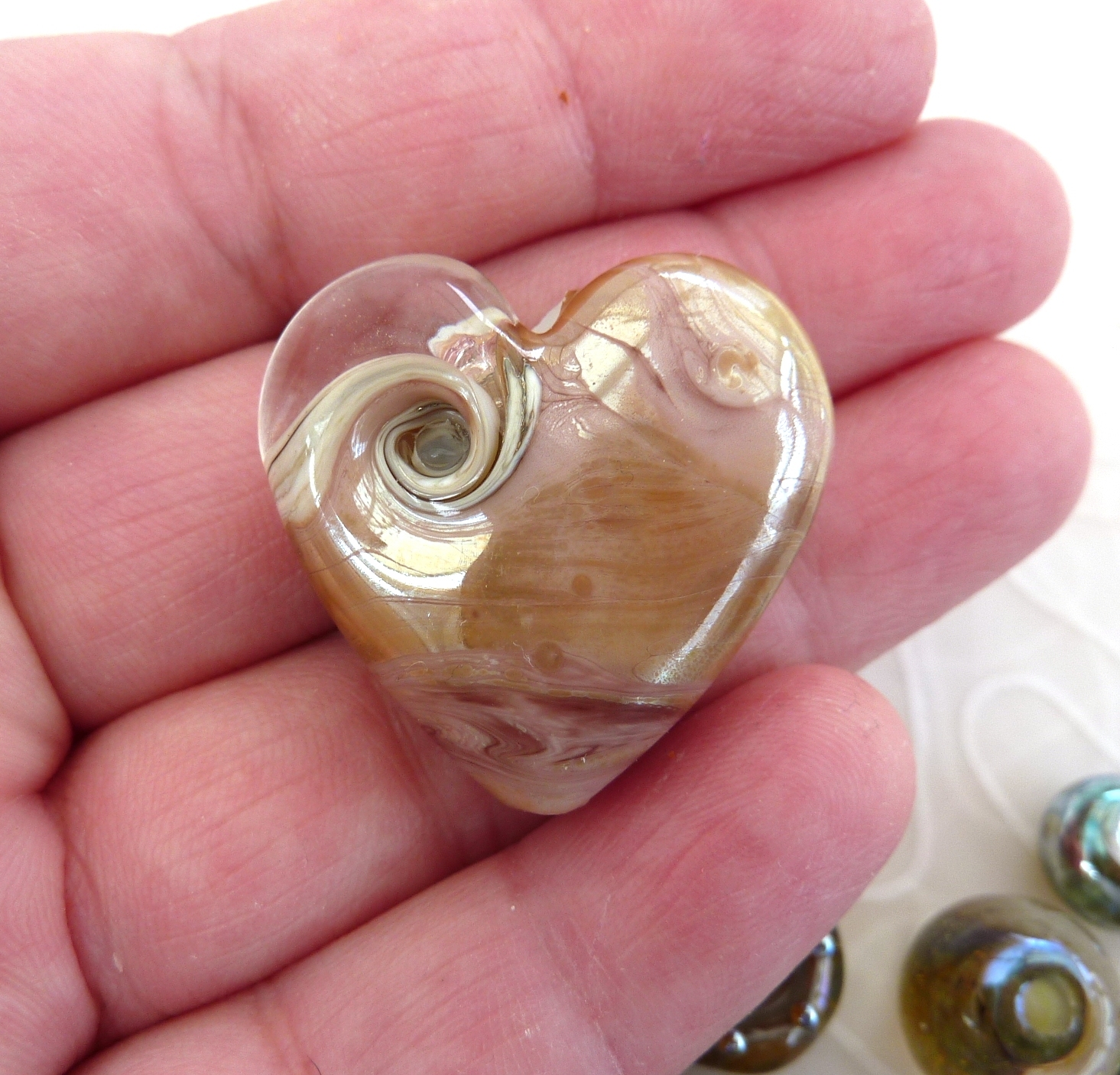
I made this heart from Verde Muschio with a Notos shoulder and spots. The Verde Muschio - which I think means Moss Green - is really surprising.
It starts out transparent, develops a bloom as it cools and ends up cloudily opaque - I love it! The heart is a darker green than the lentil, probably due to the fuming effect of the silver glass ... interesting ...
Vetrofond Mauvelous is simply marvellous! Its a pretty pale creamy mauve with a beautiful lustred sheen and just looks fabulous on its own. My torch tends to be a little reducing, so a more neutral environment may produce less, or more even, sheen.
Effetre Sandstone and Sediment are two lovely organic glasses that also work so nicely on their own, together or as an organic base. I haven't yet had chance to try them with silver but I can just tell they'll be great.
I tried Pinky Winky once before and didn't really get it ... and I must admit, I still don't get it. Its an odd combination of pink over blue, and I find the blue just makes the pink look a bit dirty. But that just might be down to what I did with it!
Let's get a little brighter ... Vetrofond Orange Punch, Dreamsicle and Transparent Orange are next.
Orange Punch is a rich, reddish orange.
Dreamsicle is bright, with lots of lovely depth.
Transparent Orange made my mouth water like a juicy ice lolly, its not really transparent at all, more like a CIM opal, brilliant!
I also had another very quick play with the new Effetre Cool Earth and Streaky Denim. I managed to avoid Streaky Denim reducing this time and I'm pleased with the purple (just a touch of reduction on the edges).
Earth is a strong, rich blue with a touch of green.
Let's finish with another look at that Mauvelous heart!


Thank you Julie for sharing with us new colors.
ReplyDeleteLove the "mauvelous", "Hearth", and "Streaky denim". Transparent orange looks like "Creamsicle", the old one, because i cannot find it the same now, it is more yellow than orange !
Did you get them from Tuffnell ?
I wish you a lovely Sunday.
Veronique
Thank you! Yes, all from Tuffnell Glass.
ReplyDelete