skip to main |
skip to sidebar
A lovely bundle
Look at this lovely little bundle of glass I got in the post last week. It came from Creation is Messy HQ, via Tuffnell Glass.
Rarely do new colours inspire me as much as these to run straight out to the studio and get playing. The first colour that really got me excited was the beautiful glowing opal blue called Poseidon.
To be completely honest, I was a little concerned to find that the first bead I made with Poseidon and Cardamom (more about that beauty shortly) actually came out of the kiln cracked. I'm not sure if I admired it too long before putting it to bed, so the next day I reheated it in the kiln, carefully introduced it back to the flame and thoroughly warmed it through to heal the crack. Its actually about a week now since I made it and no crack has reappeared so I'm pretty certain it was my fault and the glass is not to blame!
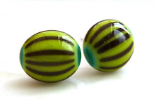
So I'd describe Poseidon (bead 2) as a greeny blue, sitting somewhere between Chalcedony (bead 1) and Kryptonite (bead 3) ... mmm, gorgeous!
Have a look at the other side, aren't these just lovely colours together?
However, it does have a tendency to over strike and become a little muddy as in these two beads. In no 1 I have used Poseidon with another of the new CIM colours, Linen, and quite a lot of SIS and silver wire - its possible that the silver has fumed the Poseidon and caused it to darken. Bead no 2 is the one I mentioned earlier, that I had to reheat, and I think the colour has lost its clarity due to overworking. It doesn't look too bad on this photo but bead no 2 is not pretty!
Look at this! Both the Poseidon (bead 1) and the Kryptonite (bead 2) have reacted in the same way; they've gone opaque at the bottom and retained their semi-transulency (is that a word?) further up. Presumably this is due to the relatively large mass of opal glass and the more gentle flame I've used compared to when I made the first beads. Great effect.
The next new colour on my shopping list is CIM Cardamom, its such a pretty, fresh, delicate green, lighter than Elphaba or Effetre lime and sharper than Dirty Martini. I really can't think of another opaque green to compare it to. So bead 1 is the aforementioned Cardamom with Poseidon, bead 2 is with Fremen (my favourite combination), bead 3 with Dirty Martini (on the bottom) and bead 4 with Celadon. SIS sits nicely on Cardamom and isn't swallowed up into a thin line, as is the case with a lot of greens. I'm yet to try dots on Cardamom, but there's plenty of time for that because I'll definitely be ordering this colour.

Now onto Peachy Keen, the very pale transparent rod you can see in the top photo. I was surprised by how dark this colour actually became when it was worked, closer to ginger beer than peach, I think. Its a nice colour and etches well. In this photo bead 1 is Peachy Keen with Linen and SIS; I think bead 2 was the same combination but I wrapped rather too much silver foil around it; and bead 3 shows how nicely Peachy Keen etches.
The last rod was Linen. Its a nice neutral, one rod wasn't enough to play around with it much. You can see it in the above photos with Poseidon and Peachy Keen, and I also used it in the Poseidon heart bead instead of the Effetre ivory I've used in the other seaside beads. Sorry, I don't have any better pics of Linen as it took a supporting role.
Just to add, thanks to Emma at Tuffnells for sending me a second rod of Poseidon and Cardamom to continue to experiment with. I still have a little bit of each left and will post if I find anything else interesting!


lovely colors!!!!! (and beads ,-) ) Hugs, Doris
ReplyDeleteThanks Doris!
ReplyDeletebeautiful!!!!
ReplyDeleteGorgeousness...and I am sure semi-translucency must be a word!
ReplyDeleteooooooooo peachy keen looks delish
ReplyDeleteVx